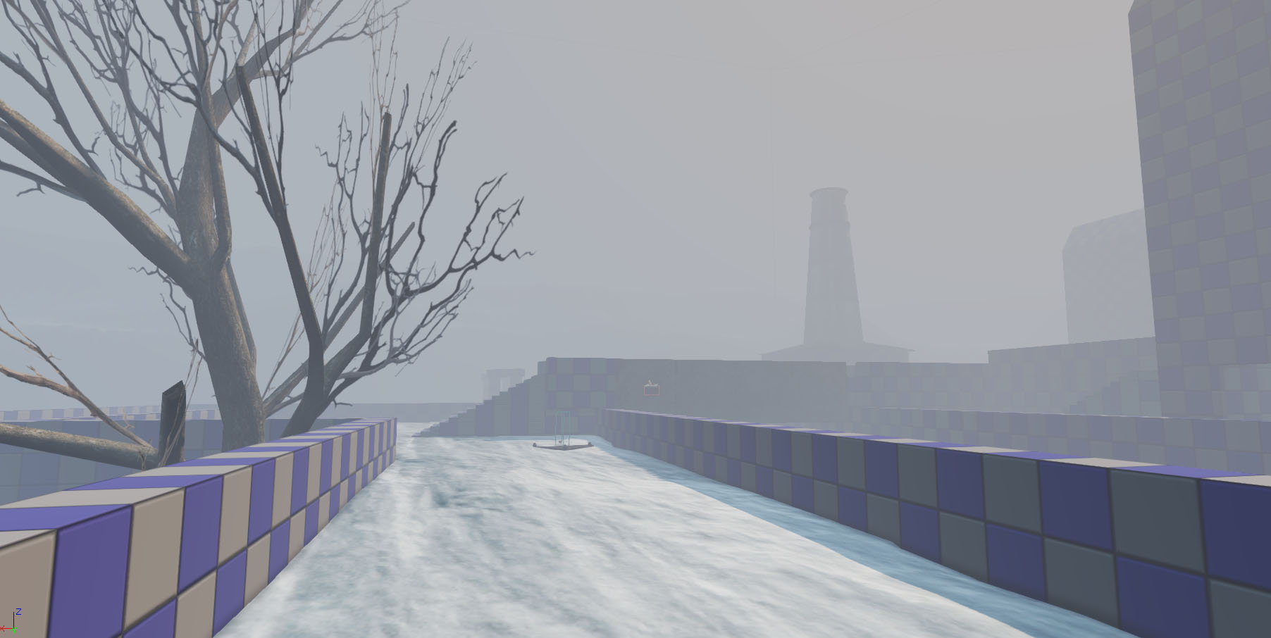
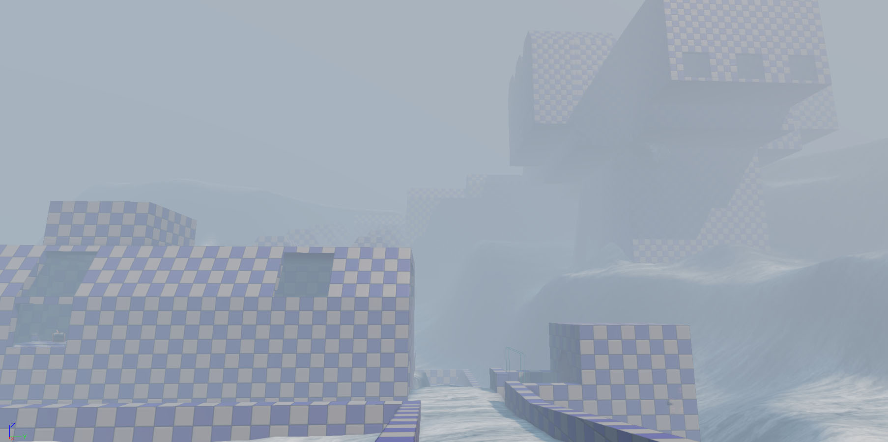
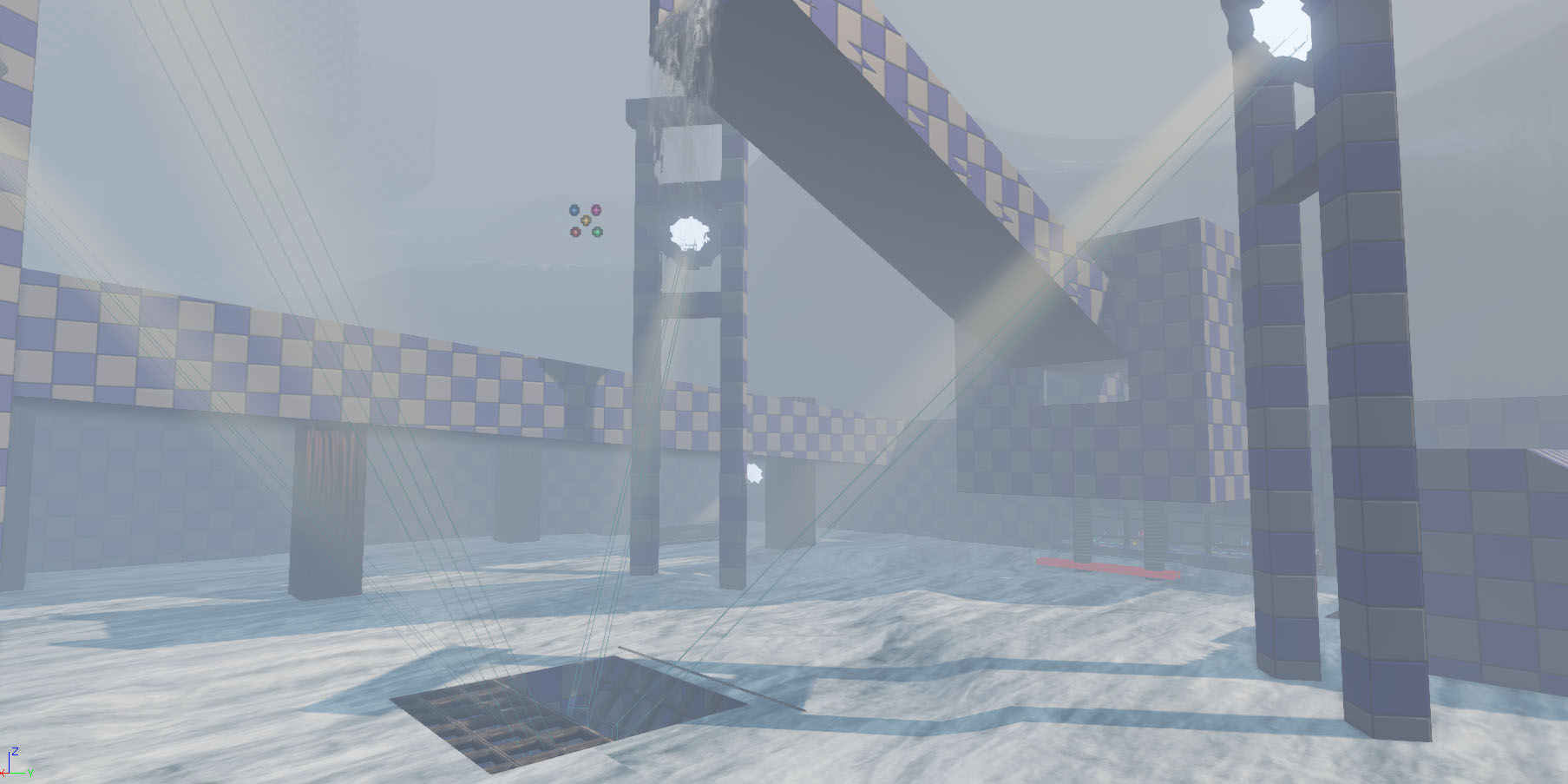
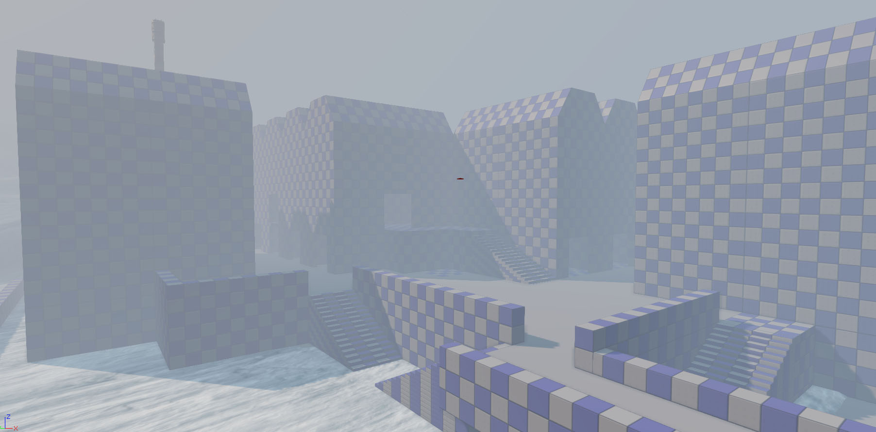
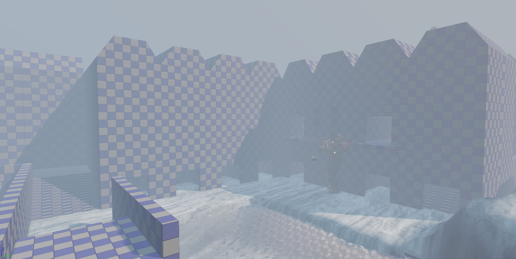
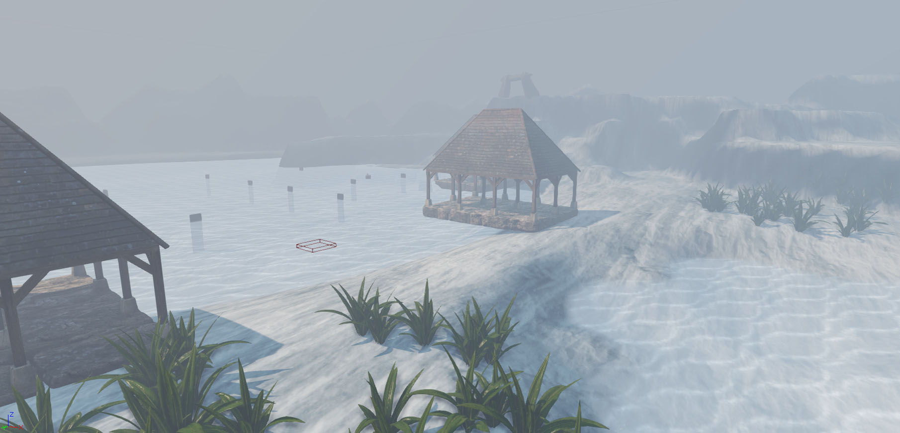
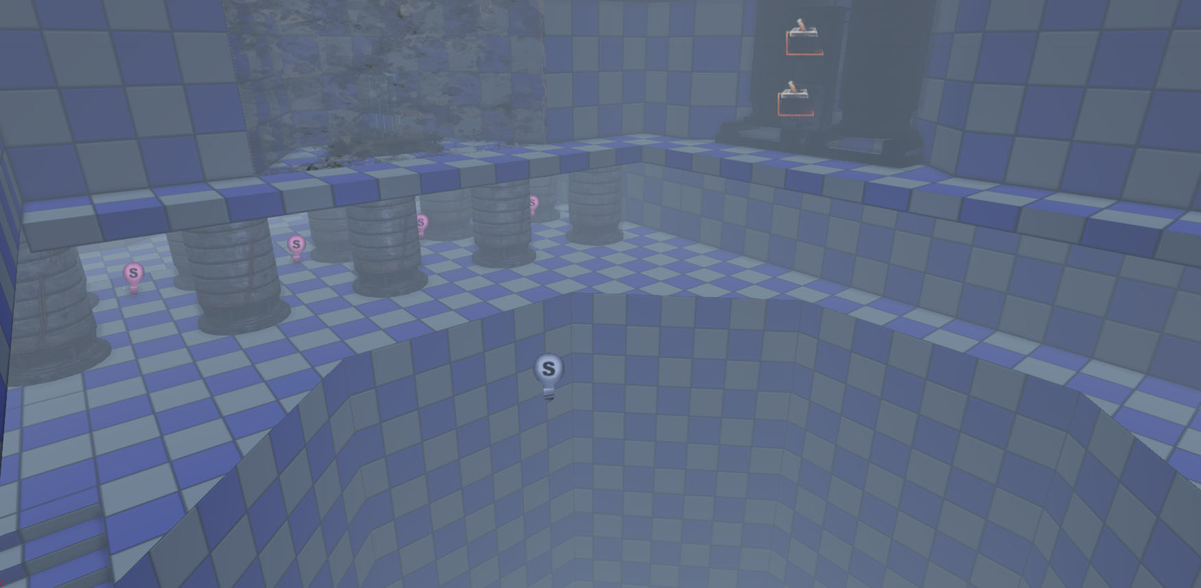
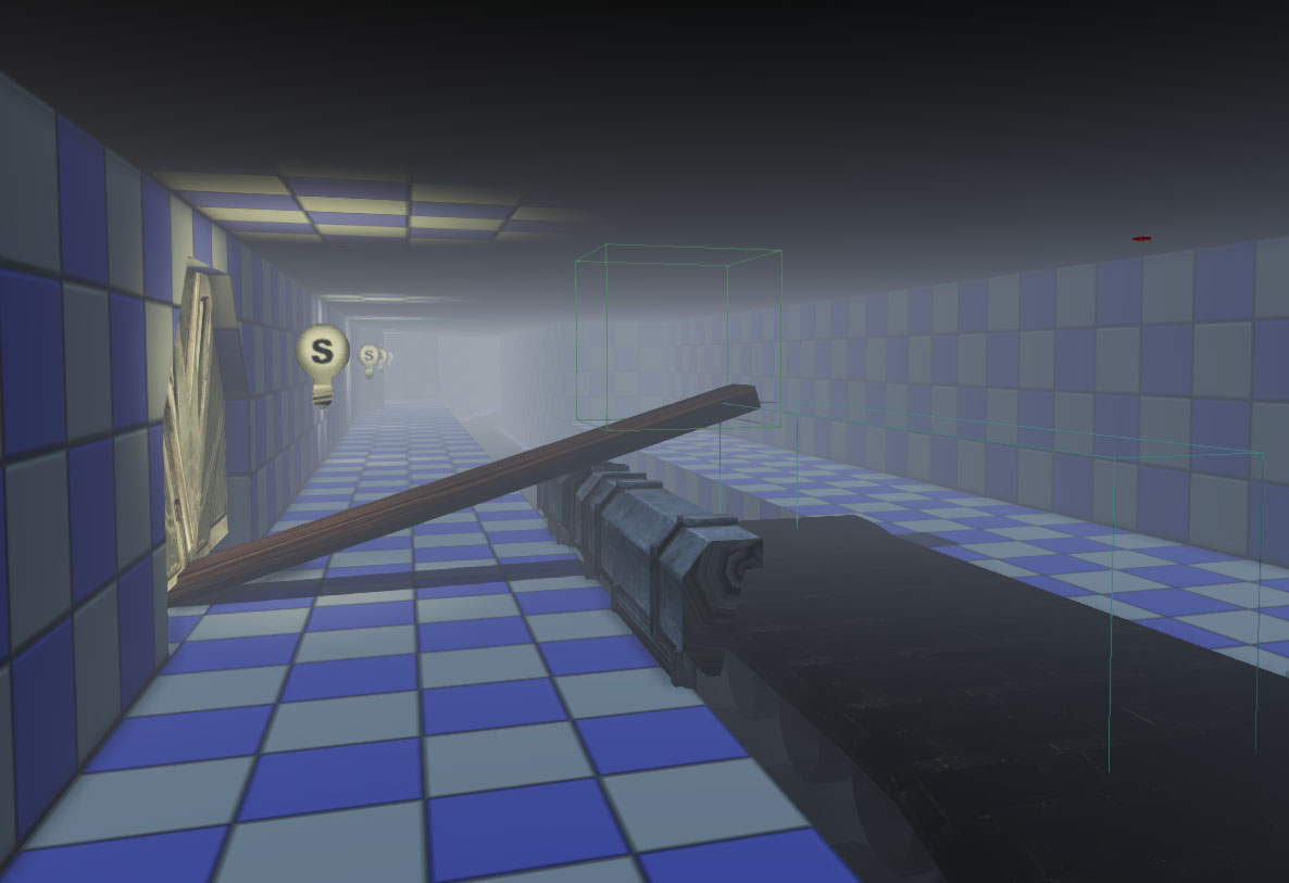
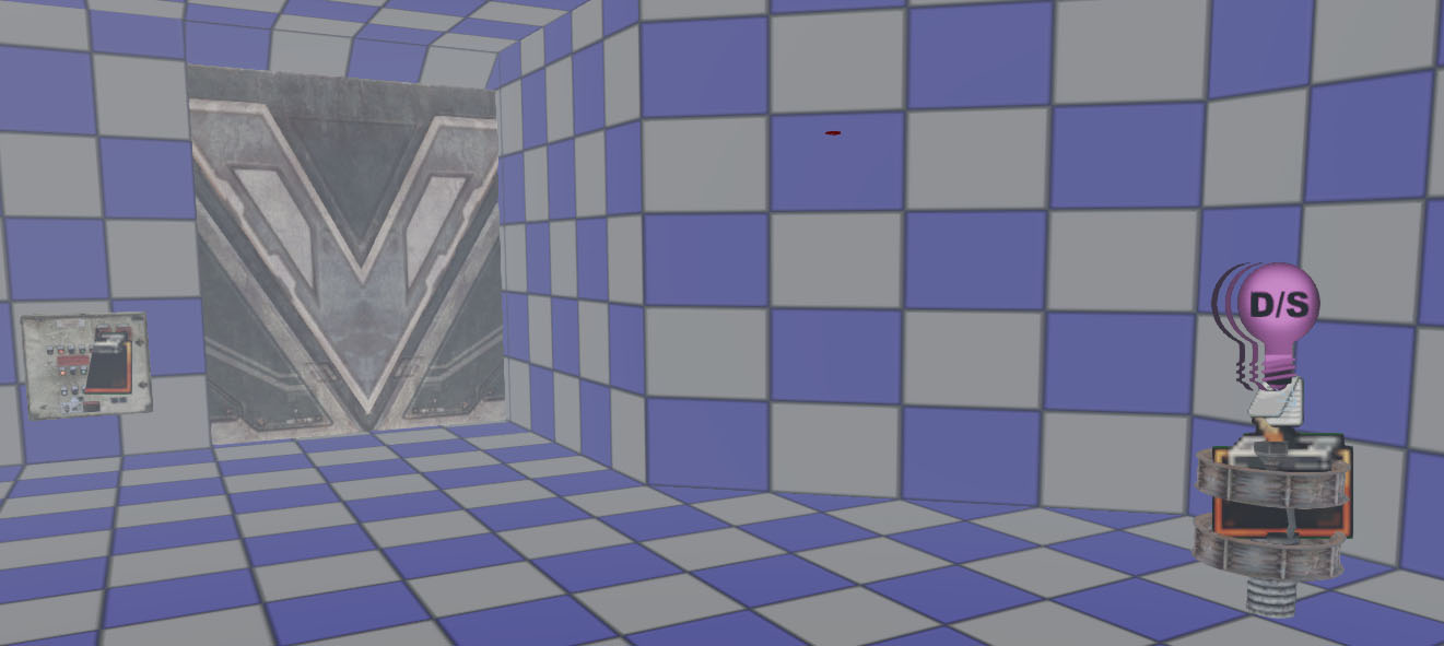
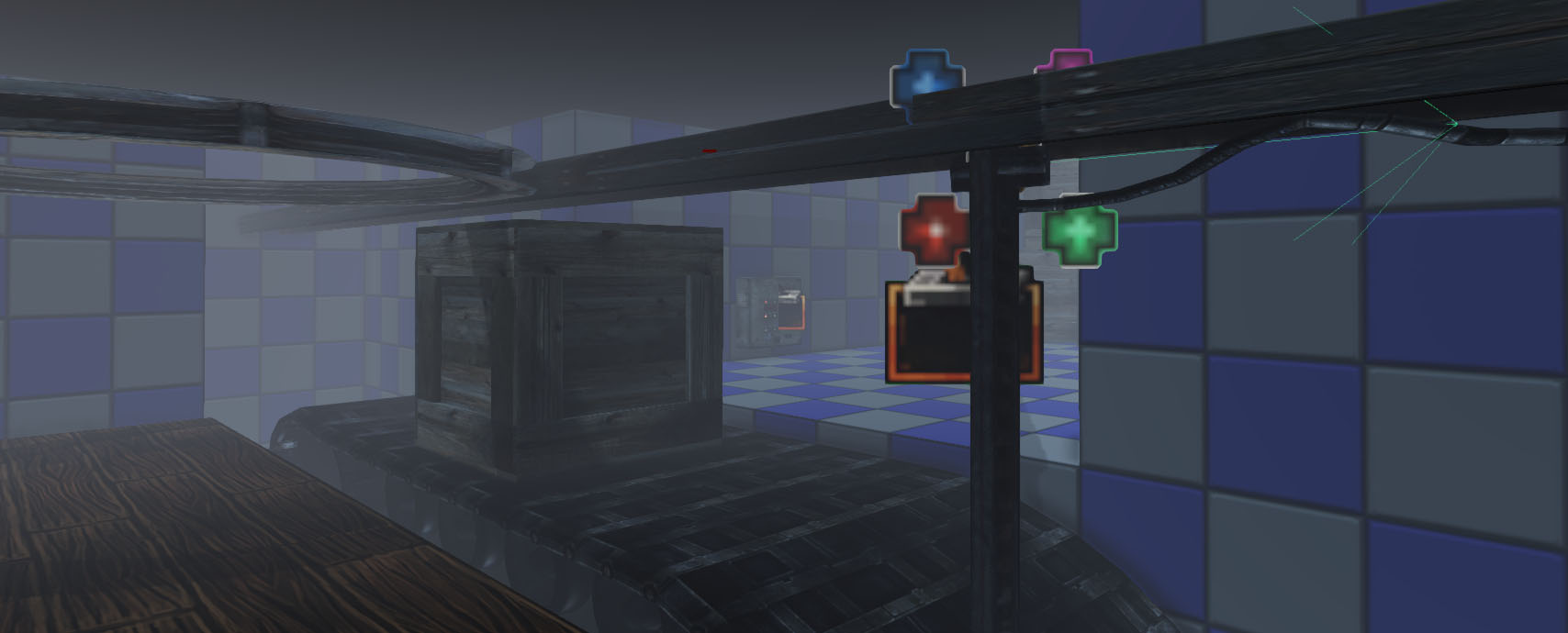
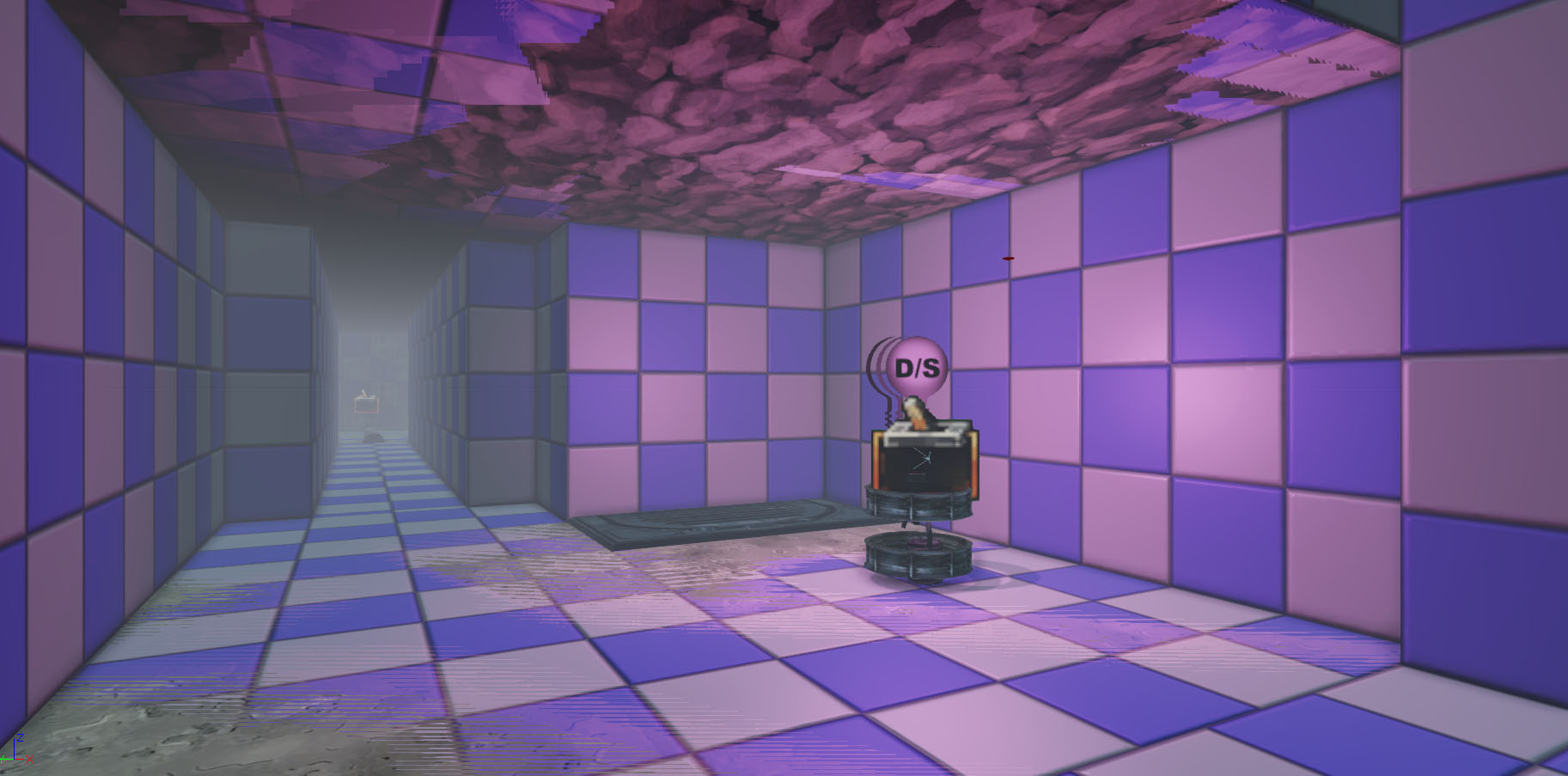
I realised I hadn’t posted much about the design stuff I had been working on recently. I finished this blockmap around a month ago and at the moment we’re testing it and tweaking the gameplay. It’s a pretty basic whitebox (which is how I like them) with UDK assets thrown in there as placeholders. In some parts I added more detail than needed, this helps me to get the feel of the level which is quite important to me.
I generally work off a quick paper design but don’t spend too long on it. I don’t spend too long because I think its only when you get it into the editor that it really comes alive. However, paper design is an important step as it gives you a good layout and direction and allows you to focus on getting it interesting when you get it into the editor. Generally, people that go straight into editor without basic planning end up having a very linear and repetitive level design which the experience suffers for in the end. Anyway, check them out! Not going too much into the design as we want to keep quite a lot of the rest of the game hidden until you actually play it!
Memory lane.
Schoolhouse and Village
Mining area.
Village continued.
Village continued.
Lady of the Lake.
Testing begins.
Transportation.
Puzzle idea.
Puzzle idea.
Puzzle idea.
So as you can see, a good direction in place, the later shots have static meshes being overlaid on the whitebox. These are assets that we can re-use from the first level from the mining area. This level very much focuses on Jeans past and her memories growing up so some exciting parts of narrative and gameplay in this episode I think.
Next step is to continue testing and tweaking, not the most fun part when you’ve spent a couple of weeks on the same blockmap but an essential step!
